Anatomy of Type
It may go missed to the untrained eye, but typography can make or break a design.
From a perfectly kerned logotype to a beautiful editorial layout, knowing your typography is an absolute must.
Ligature
Two or more letters combined as a single character. Ligatures are used to clarify pronunciation or for aesthetic purposes.
?
Cap Height
The height of an uppercase letter. Measured most accurately on a character with a flat bottom, ie. E, H, I.
x-height
The height of lowercase letters not including ascenders or descenders. Specifically the lowercase x.
Baseline
The imaginary line on which the bottom of letters without descenders sit.
?
?
?
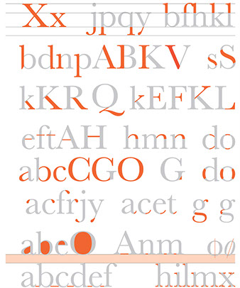
Serifs
A short finishing stroke the crosses or projects from a stem or stroke.
Serifs are classified as hairline, slab, or wedge and they are bracketed or unbracketed. See the glossary below for a full description of these.
?
Kerning
The adjustment of space between characters to improve overall appearance of a word.
?
Leading
The vertical distance between lines of type, measured from baseline to baseline.
?
Aperture
The opening at the end of an open counter.
?
Counter
The fully or partially enclosed space within a letter.
?
Axis
An imaginary line drawn from top to bottom of a letter bisecting the upper and lower strokes.
The inclination of the axis of the lowercase o is used to measure the angle of stress.
?
Loop
The enclosed or partially enclosed lower portion of a two-story g.
?
Link
The connecting stroke between the upper bowl and lower loop of a two-story lowercase g.
?
Ear
A small stroke protruding from the upper bowl of a two-story lowercase g.
?
Finial
A tapered or curved end of a letter.
?
Ball Terminal
A stroke ending that has a ball shape. Commonly appears in serif typefaces.
?
Spur
A small projection at the end of a curved stroke. Some refer to the small projection on the uppercase G as a spur, and use the term 'beak' for other letters.
?
Stress
The thickening of a curved stroke which has a contrast of thickness.
?
Bowl
The curved stroke that fully or partially encloses a letters counter.
?
Hairline
The thinnest stroke of a letter which has a high contrast of thickness.
?
Shoulder
A curved stroke that mergers into a straight stem. lowercase letters h, m, n and u are all examples of letters with a shoulder.
?
Crossbar
The horizontal stroke that intersects or connects with one or more stems. Some only use this term for enclosed horizontal strokes that do not intersect stems. Strokes that do intersect stems would be called 'cross strokes' in this case.
?
Tail
A short downward extending stroke of a letter, such as the letter Q. The leg of the letters K and R can also be referred to as a tail.
?
Leg
The lower down sloping stroke of the uppercase and lowercase K. The same stroke of the R as well as the tail of the Q can also be referred to as a leg.
?
Arm
The horizontal or upward diagonal stroke of a letter, not connected on one or both ends.
?
Spine
The main curved stroke of the letter S.
?
Stem
The primary vertical or near vertical stroke of a letter. Some letters can have more than one stem, such as H, N and M, having two strokes each.
?
Descenders
The part of a letter which extends below the baseline. The letters g, j, p, q, y, Q, and often an italic f commonly have descenders.
?
Ascenders
The part of a lowercase letter which extends above the x-height. The letters b, d, f, h, k and l commonly have ascenders. The letter t has a shorter projection above the x-height and is not normally classified as an ascender.
?
Browse our design knowledge
-
Colour
• Colour Psychology - Coming Soon
-
Typography
-
Layout
The Grid System - Coming soon